Stephen Walter is a London artist who draws unique maps. Familiar London neighbourhoods but seen from his personal perspective and showing his encyclopaedic knowledge of the city’s pubs, clubs, coffee shops, and football grounds.
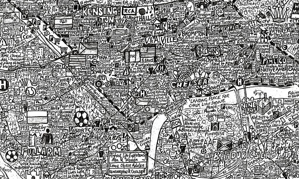
A Stephen Walter map might seem an odd choice of image for this third post in my series on the circular economy but I hope that the connection will become clearer as you read on.
In the first of this series – Circles – I wrote about the five ‘circular challenges’ described in the 2018 World Economic Forum white paper ‘Harnessing the Fourth Industrial Revolution for the Circular Economy’ and added a further four ‘challenges’ that I see as barriers to the transition to the circular economy and technology’s role in overcoming them.
In the second – Something wicked – I suggested that what these nine challenges represented was a text book example of a ‘wicked problem’ and that Systems Thinking offered us a way to better understand the extent of the problem’s wickedness.
In this post, I want to share a ‘systems map’. A graphic, showing my view of the interplay between the economic, commercial and technological issues that stand in the way of the circular economy. I’m not saying that it is finished and correct (far from it). My systems map of the circular challenges bears as much resemblance to a ‘finished’ version as Stephen Walter’s map does to Google’s version of the same area. We can recognise what it is meant to be but you wouldn’t want to rely on it to find your way from Westminster to Hammersmith. I’m simply offering it as a straw man to be discussed, criticised, taken apart and re-built with the help of those (like you) with fresh eyes, different perspectives and deeper expertise.
Kumu
Kumu is a brilliantly simple and powerful tool for creating systems maps, causal loop diagrams, stakeholder landscapes, power maps, and more. Kumu lets you unfold a diagram step-by-step, including additional data and narrative for each of the elements, connections, and loops in your map. It’s free to use for public projects and I can’t recommend it enough. Kumu is full of features that will allow you to explore the map at your leisure. If you are a registered user, you can even make a copy (they call it a fork) and experiment with your own changes.

Before you do, I want to assure you that this isn’t an academic exercise, it does have a purpose. The reason for making a systems map is that it allows us to spot places where we can make an active, practical intervention. As I wrote in the first of these posts, this is an attempt to identify opportunities. Leverage points and gaps where feasible solutions can be commercialised quickly, have clear positive impact and offer the opportunity to create something new. In my next post, I’ll answer the first of the questions that I raised – Where’s the entry point? How can we get past the ‘chicken and egg’ paradox and find the best place to innovate.
There’s a lot to digest in the map, I would really appreciate comments and questions. I’ll be back soon with some of my own thoughts on what it reveals. Some of it surprised me.
